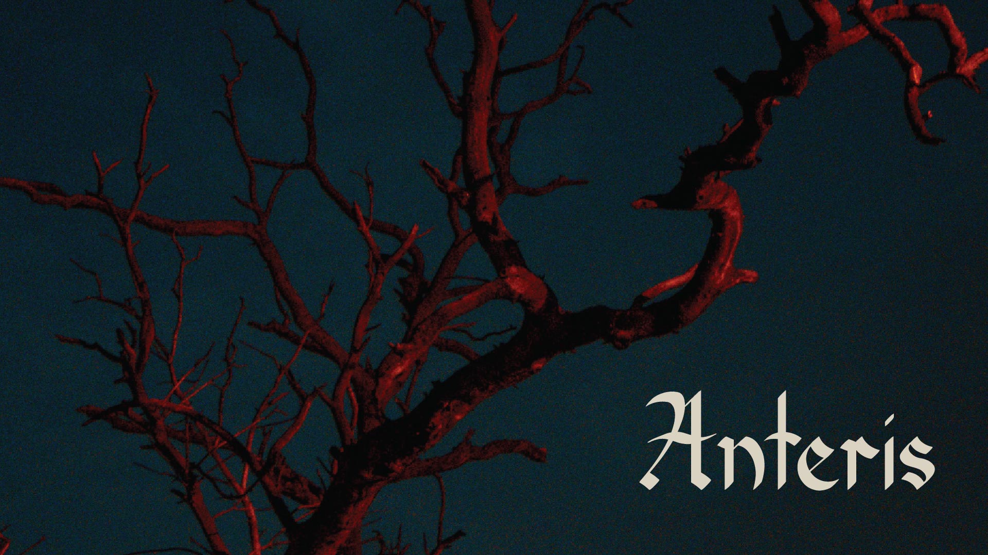
Anteris Blackletter
Gothic architecture's essence in blackletter artistry

Anteris celebrates the rich heritage of Gothic architecture through intricate calligraphy, fostering cultural appreciation and artistic expression.

Drawing inspiration from the intricate arches, ornate embellishments, and majestic proportions of Gothic and Romanesque architecture, Anteris captures the essence of a bygone era while infusing it with a contemporary twist. Each glyph is crafted with reverence for the craftsmanship and attention to detail synonymous with Gothic architectural masterpieces, resulting in a font that transcends mere letterforms to become a work of art in its own right.
While steeping in the rich history and tradition of blackletter typography, this font embraces the challenges of modern work with open arms. Its timeless elegance and versatility make it equally at home in digital interfaces, print publications, and immersive experiences, ensuring that it remains relevant and impactful in an ever-evolving design landscape.

The nuanced appeal of a Gothic architecture-inspired blackletter display font extends beyond the realms of design professionals, reaching into the domains of cultural enthusiasts, history aficionados, architectural catalogues, and luxury brands. Designed with meticulous attention to detail, this font is tailored to resonate with individuals and organizations seeking to infuse their projects with a send of timeless elegance and historical gravitas.
In a world inundated with typefaces vying for attention, there arises a demand for a blackletter font that not only exudes legibility but also encapsulates an ethereal essence, all the while staying connected to the traditional roots of blackletter typography. This envisioned font seeks to embody a subtle modernization of blackletter, elevating its readability for contemporary applications without compromising its inherent charm and historical significance. By bridging the gap between tradition and innovation, this font offers a solution for designers and enthusiasts alike who seek to evoke a sense of heritage and sophistication in their projects.
The name Anteris was carefully chosen to reflect the essence and spirit of the font. Derived from Latin, “Anteris” means “buttress,” which holds profound significance in the realm of Gothic architecture. Buttresses are integral structural elements that provide support and stability to towering cathedrals, securing endurance and grandeur. by invoking the imagery of these architectural marvels, the name Anteris embodies the font’s aspiration to stand out and make a lasting impression, commanding attention with its distinctive presence and timeless appeal. Just as buttresses uphold the magnificence of Gothic cathedrals and basilicas, Anteris upholds the tradition and elegance of blackletter typography, reinforcing its place as a cornerstone of design excellence.
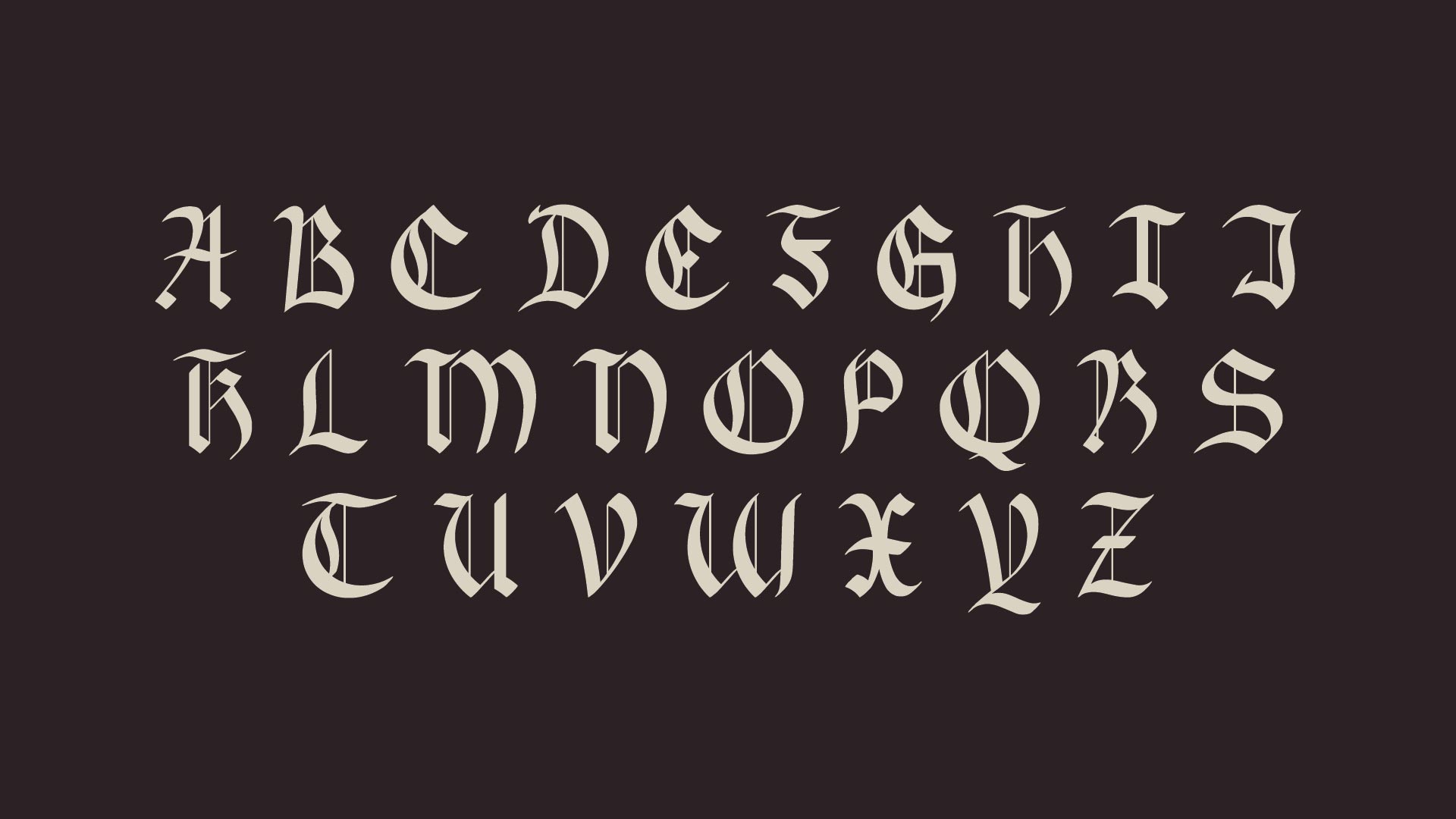
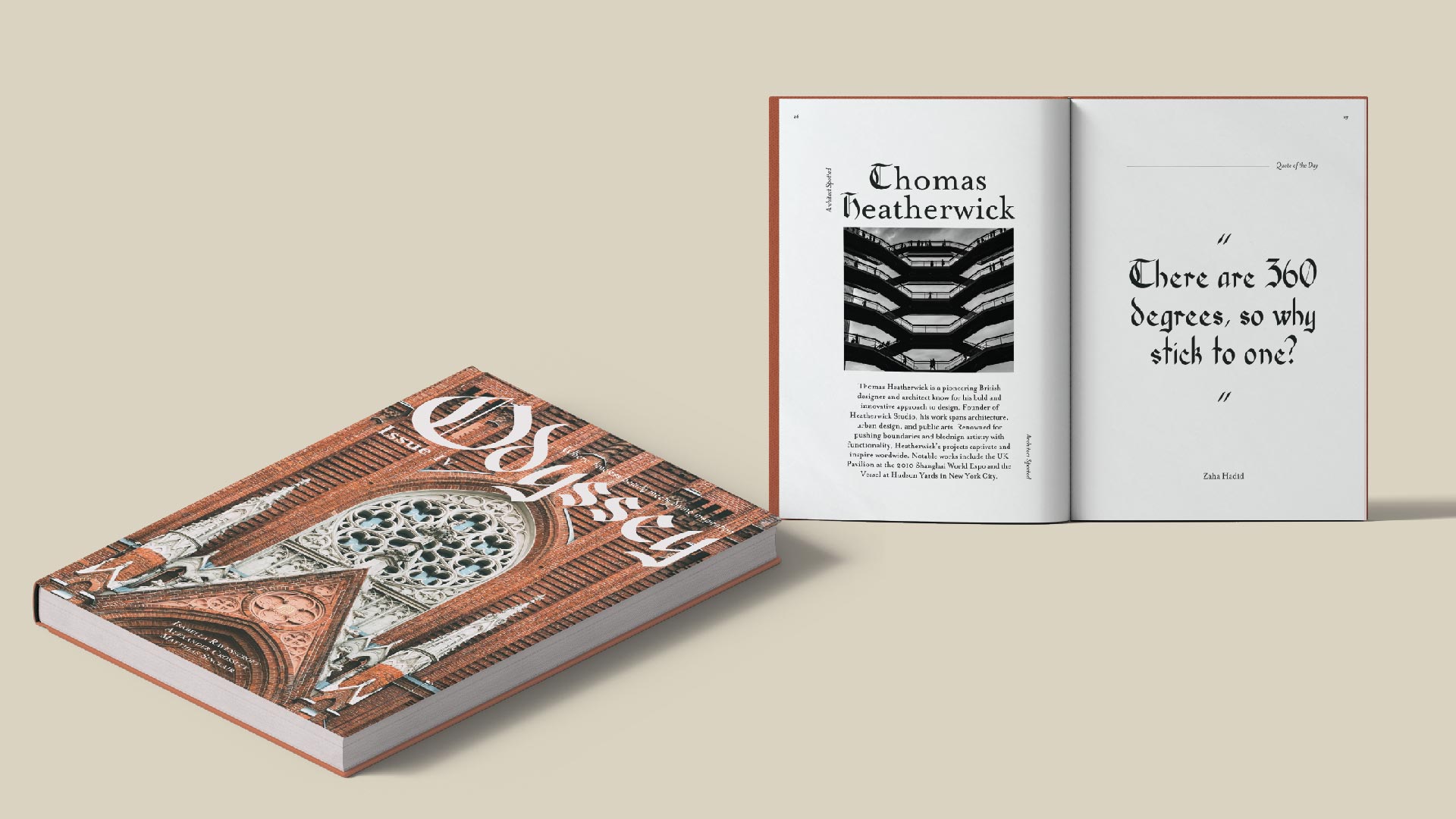
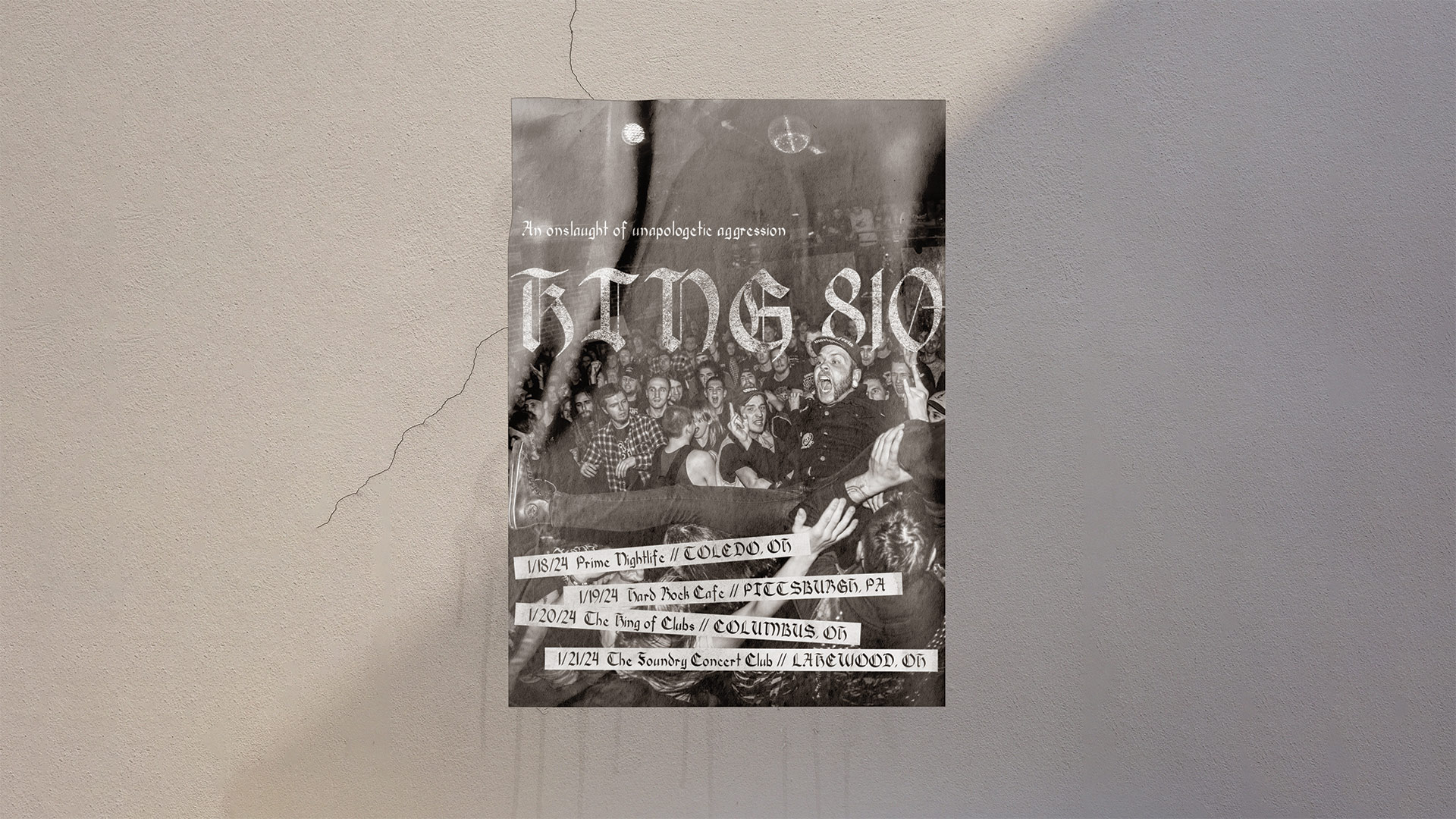
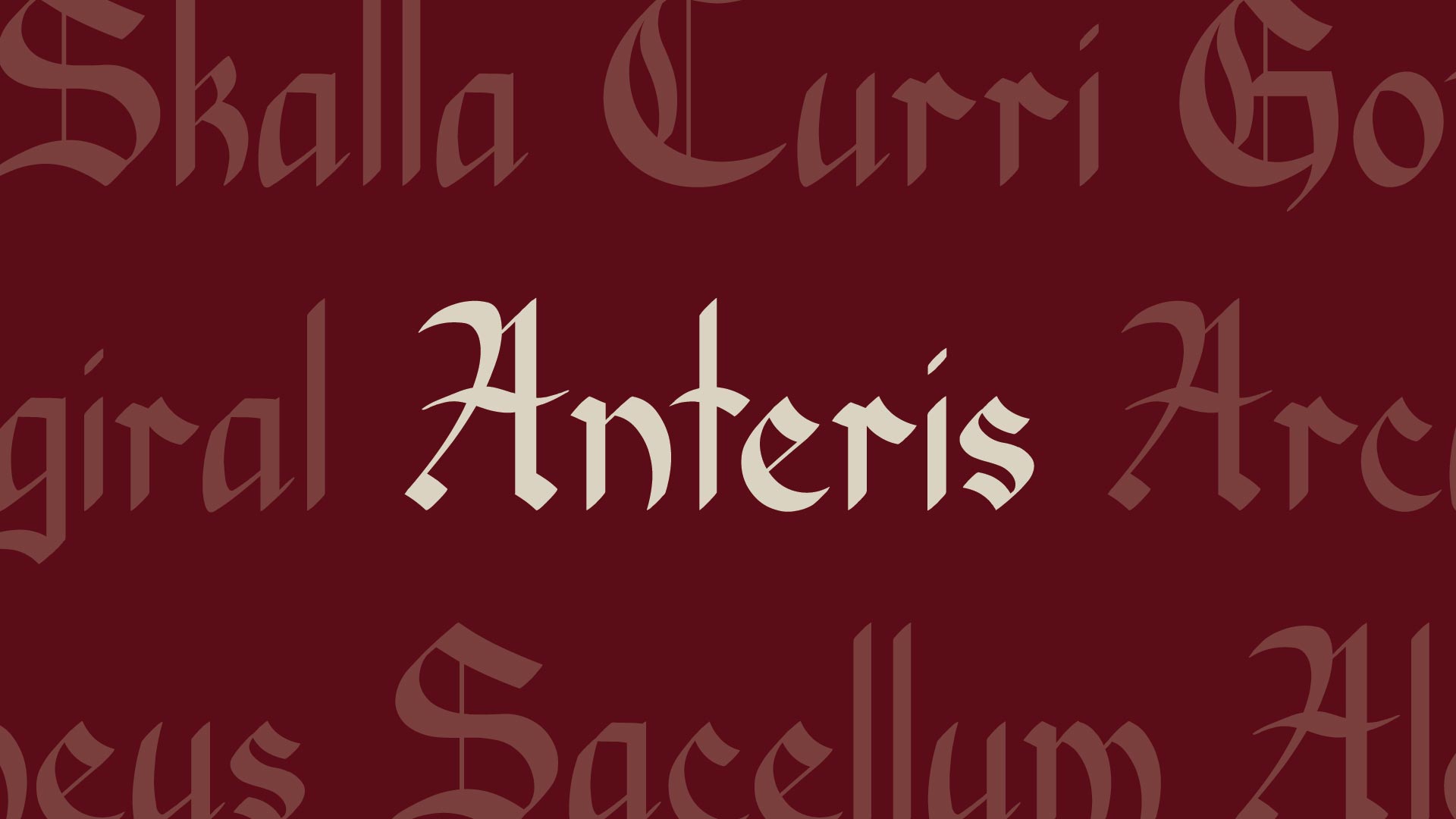
The uppercase characters exude a commanding presence, with each letter crafted to captivate the eye’s attention. From the majestic curves of the ‘C’ to the sharp angles of the ‘Z’, every uppercase letter showcases the font’s intricate detailing and historical elegance. Whether used individually or in combinations, these characters add a sense of grandeur and sophistication to any design project.
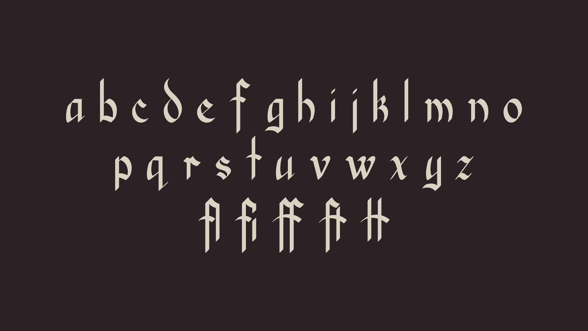
In contrast to the boldness of the uppercase letters, the lowercase characters of Anteris possess a subtle grace and fluidity. Each letter was carefully crafted to maintain legibility while retaining the font’s distinctive aesthetic. from the sweeping ascender of the ‘d’ to the delicate yet sharp curves of the ‘s’, the lowercase characters offer versatility and charm, making them well-suited for both display and text settings.
Along side these, Anteris features a small selection of ligatures that enhance the fluidity and beauty of the font. These ligatures combine specific letter pairs to create harmonious connections and improve overall readability. While the combinations may be common, each one adds a touch of class and craftsmanship to the text.
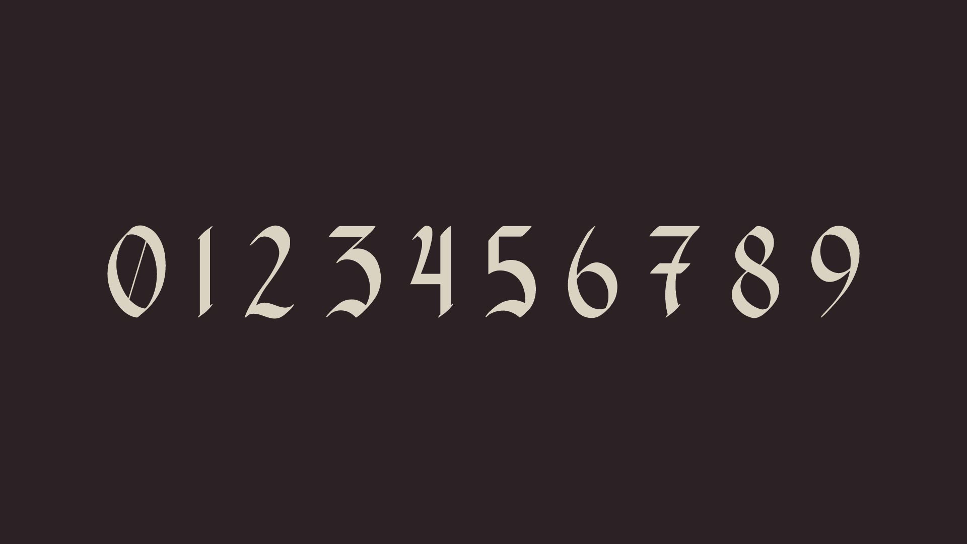
While blackletter often incorporated roman numerals instead of regular numbers, Anteris features a set of numerals that seamlessly integrate with the font’s overall aesthetic, offering a blend of historical elegance and modern refinement. Whether used to convey numerical data, dates, or other numeric information, the numbers of Anteris add charm to any project.
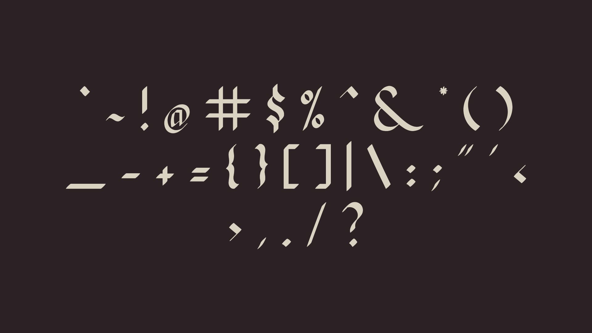
In addition to its comprehension character set, Anteris offers a range of glyphs, including punctuation marks, special symbols, and decorative elements. From timeless grace of the ampersand ‘&’ to the flourishes of the curly brackets ‘{}’, each glyph is created to complement the font’s overall aesthetic and enhance versatility. Whether used to add visual interest to headlines, emphasis key points in text, or embellish design elements, these glyphs provide designers with a wealth of creative possibilities.
In the creation of Anteris’ characters and glyphs, a meticulous process unfolded, blending artistic vision with technical precision. Each glyph began as a sketch, capturing the essence of the font’s aesthetic while exploring variations in form and style. Through iterative refinement, sketches evolved into digital renderings, where every curve and flourish was carefully honed to perfection. Attention to detail was paramount, ensuring consistency and cohesion across the entire character set. Notably, a primary focus throughout the design process was legibility, with diligent decisions and adjustments for clarity and readability.
Particularly, the uppercase, glyphs received extra attention, with embellishments and refined proportions created to evoke a sense of grandeur and sophistication. The outcome is a cohesive and captivating experience where every glyph seamlessly integrates with the fonts overarching style.
Additionally, Anteris’ versatile desing and low x-height makes it easy to pair with complementary and elegant fonts such as Mrs Eaves, Brandon Grotesque, and Bernhard, offering endless creative possibilities and typographic harmony.
Let’s connect and work together: