Wall To Wall Festival
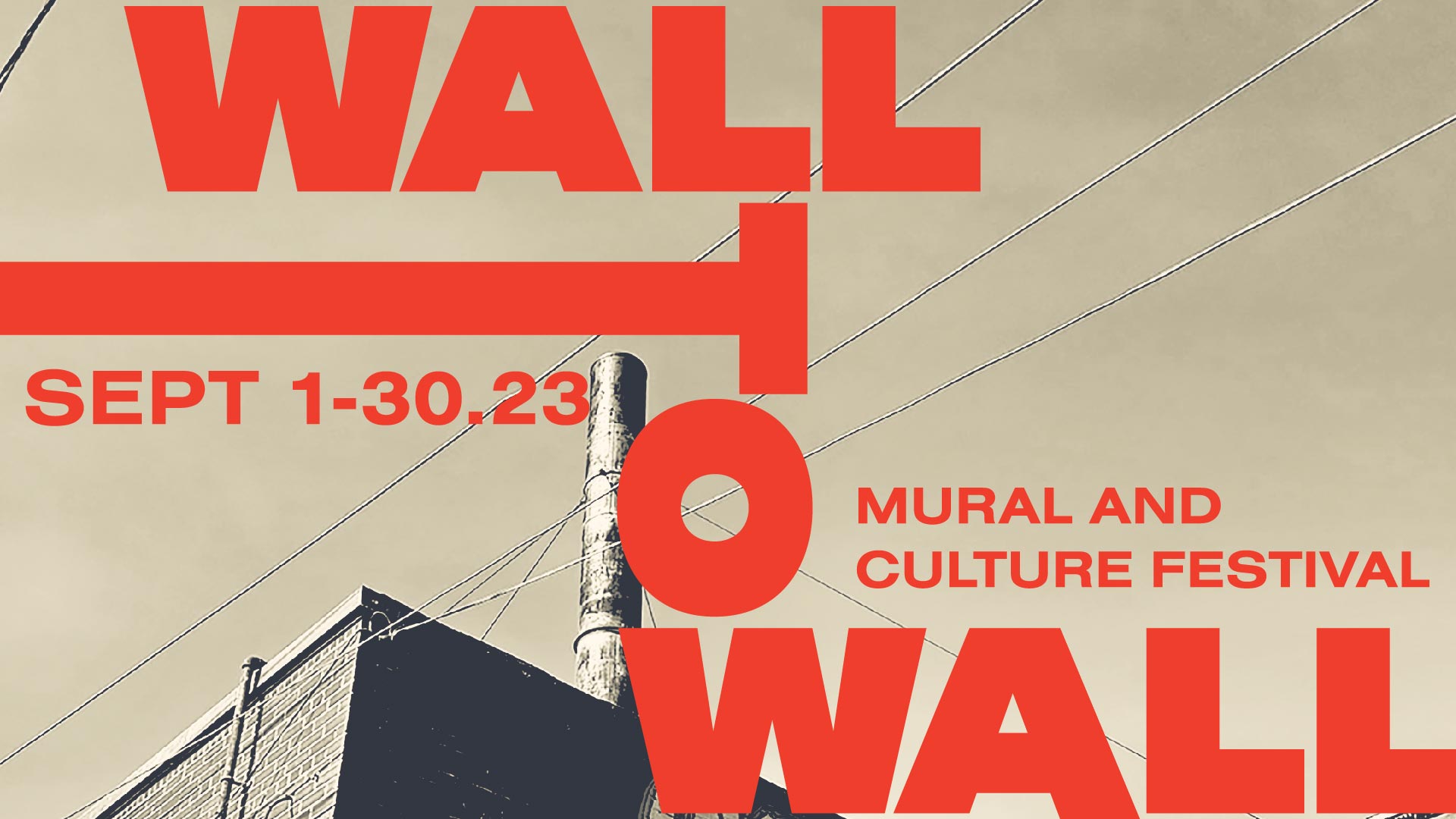
Art for everyday life
Wall-To-Wall Mural and Culture Festival in Winnipeg, MB, is an annual celebration of mural art and cultural exchange. Through vibrant displays, performances, and interactive experiences, it fosters community connection and celebrates diverse artistic voices, both local and international.
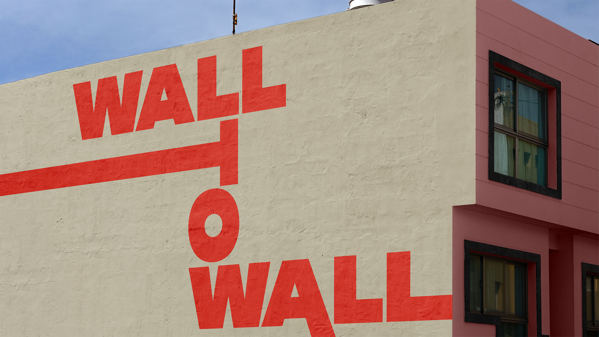
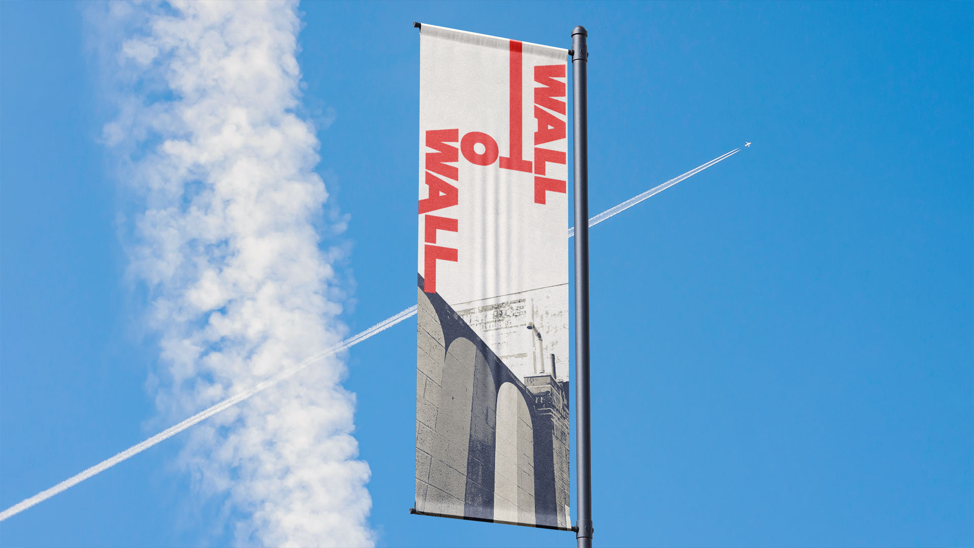
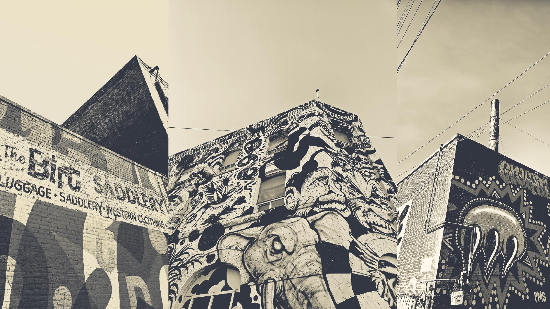
The purpose of this project was to craft promotional materials for an event in Winnipeg. Through thorough research, I chose the Wall-To-Wall Mural and Culture Festival. Within the creative endeavour, I aimed to capture the festival’s essence through visually compelling posters and social media assets. Each poster meticulously curated imagery showcasing the vibrant murals from past years, artfully enhanced with a neutral sepia/beige gradient overlay to evoke a sense of enduring beauty and cultural richness. At the forefront of these designs stood the carefully crafted wordmark I conceptualized specifically for the event. This unique typographic arrangement of “Wall To Wall” not only served as the festival’s focal point but also became an embodiment of its dynamic spirit, ingeniously blending elements of tradition and innovation.
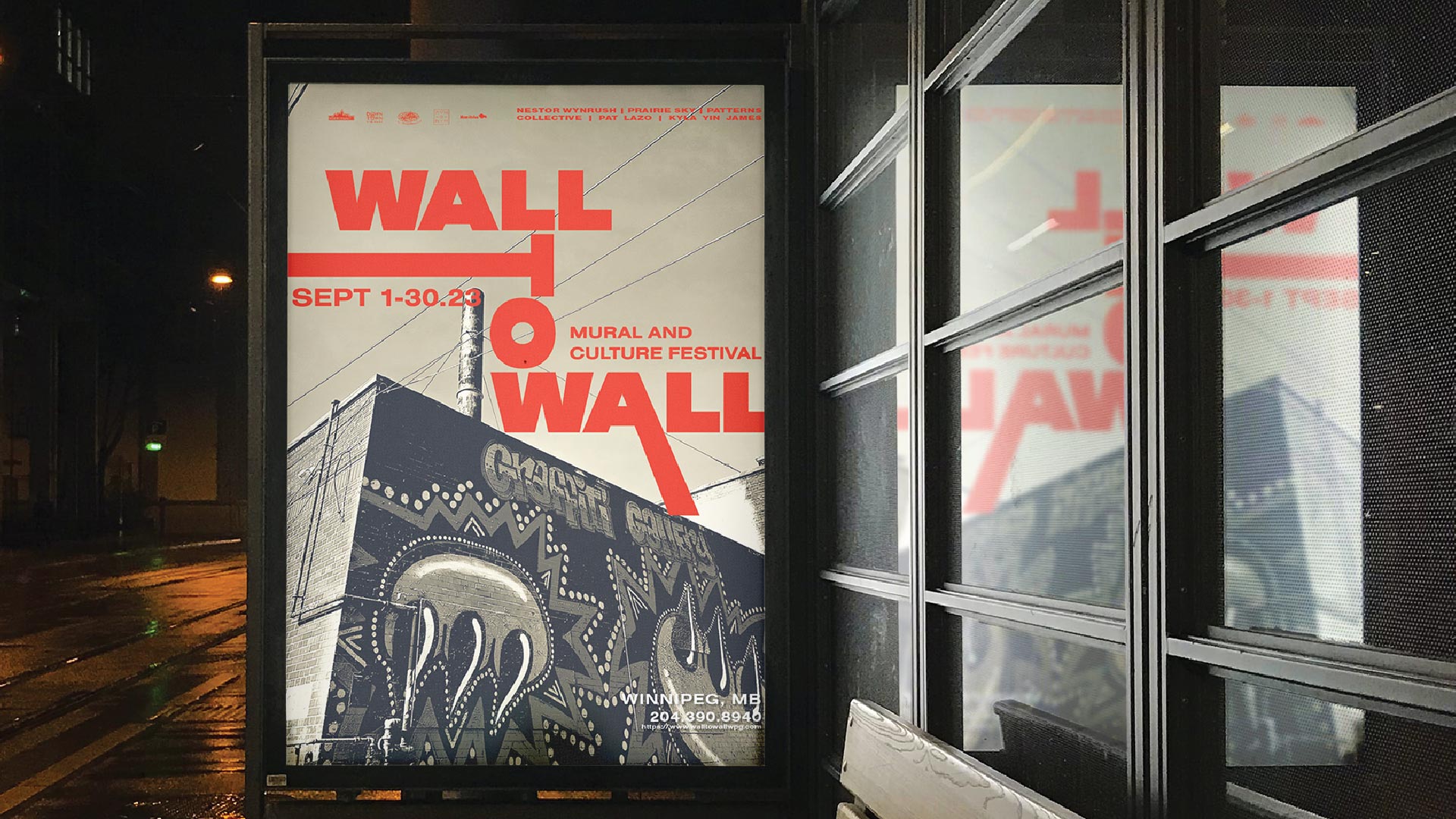
While this project was not officially commissioned by the festival, it represented a passionate exploration of the festival’s branding potential. Through innovative layouts and strategically extended letterforms, the design aimed to captivate viewers and spark intrigue about the festival’s immersive celebration of mural art and cultural diversity within the city. Throughout this project, I aimed to spotlight the festival’s capacity to enrapture audiences and make a mark on Winnipeg’s cultural tapestry, igniting anticipation for future years of the Wall-To-Wall Mural and Culture Festival.
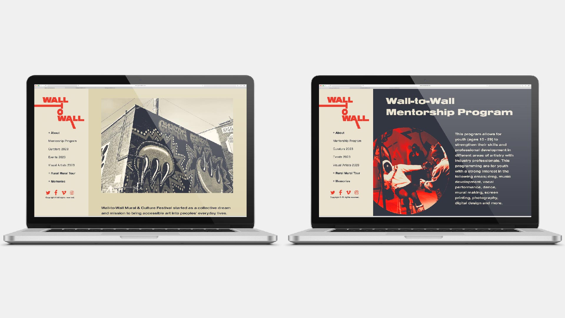
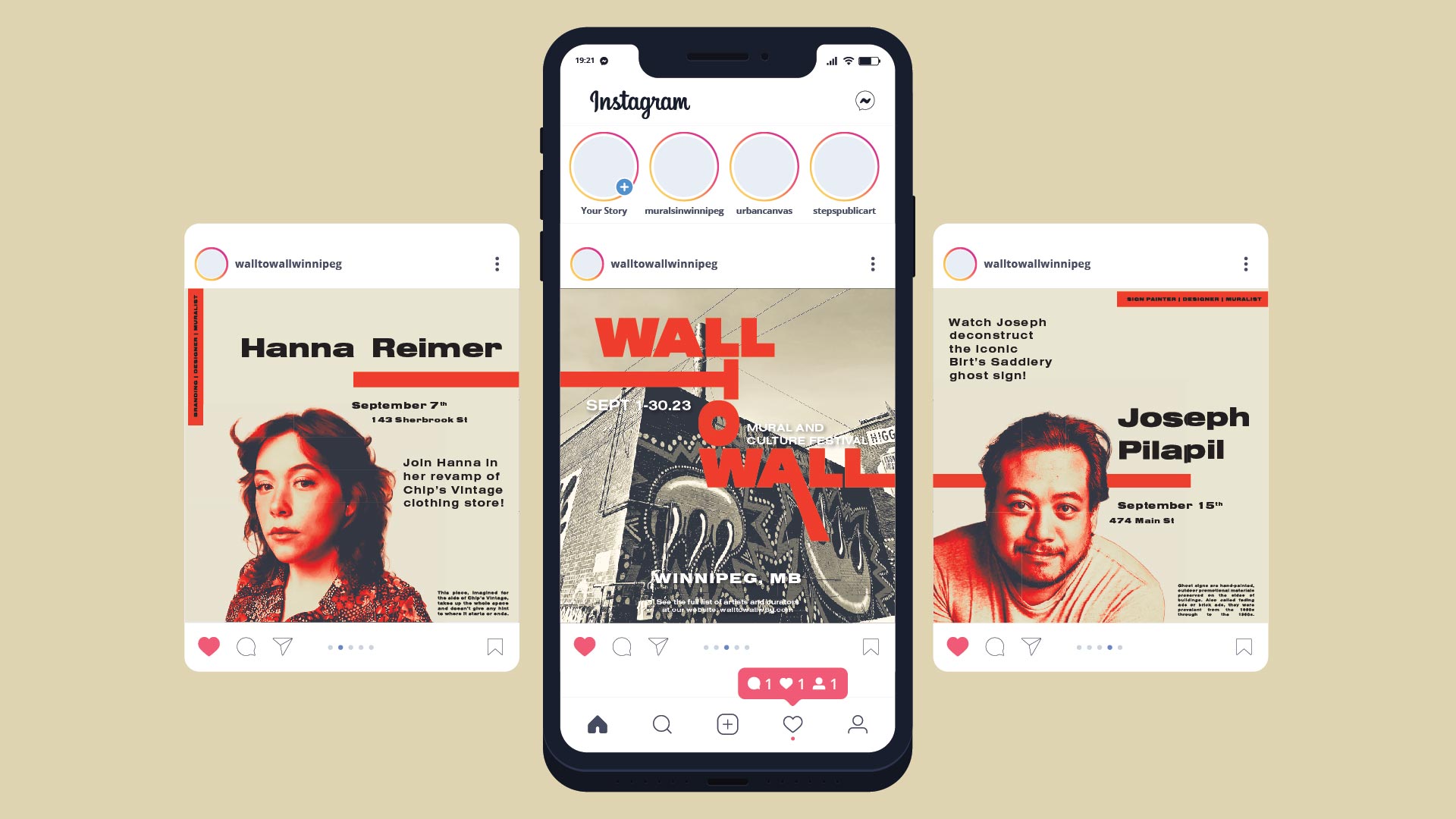
The colour palette for the Wall-To-Wall Mural and Culture Festival infuses richness and depth, reflecting the diverse tapestry of artistic expression showcased at the event. At its core lies Pomegranate, a vibrant hue that embodies creativity and vitality, mirroring the dynamic energy of the festival itself. Complementing this bold tone is Gun Metal, adding a touch of sophistication and urban edge to the palette. This deep, charcoal grey serves asa grounding element, proving contrast and allowing other colours to pop against it. Finally, Dutch White lend a send of warmth and serenity, evoking the spirit of community and inclusivity that defines the festival. Together, these colours create a harmonious visual landscape, inviting attendees to immerse themselves in the kaleidoscope of artistic expression and cultural celebration at Wall-To-Wall.
Pomegranate
Pantone P 45-8 C
HEX: D8402F
RGB: 216 64 47
CMYK: 0 74 81 6
Gun Metal
HEX: 323640
RGB: 50 54 64
CMYK: 22 16 0 75
Dutch White
HEX: DED3B1
RGB: 222 211 177
CMYK: 0 5 20 13

Aa
Nimbus Sans Extended
Aa
Nimbus Sans
The typography selection for the Wall-To-Wall Mural and Culture Festival encapsulates its vibrant and diverse artistic landscape while ensuring clarity and visual impact across all communications. Telka Extended takes centre stage in the wordmark treatment, infusing the festival’s branding with boldness and modernity, while Nimbus Sans Extended adds a sleek and contemporary touch to subheads, complementing Telia’s dynamic presence. For body copy, Nimbus Sans offers versatility and legibility, maintaining consistency and facilitating easy navigation of event details. Together, this typography suite forms a cohesive visual language that amplifies the festival’s message of creativity, inclusivity, and community celebration.
Let’s connect and work together: